SELECTED CLIENT WORK
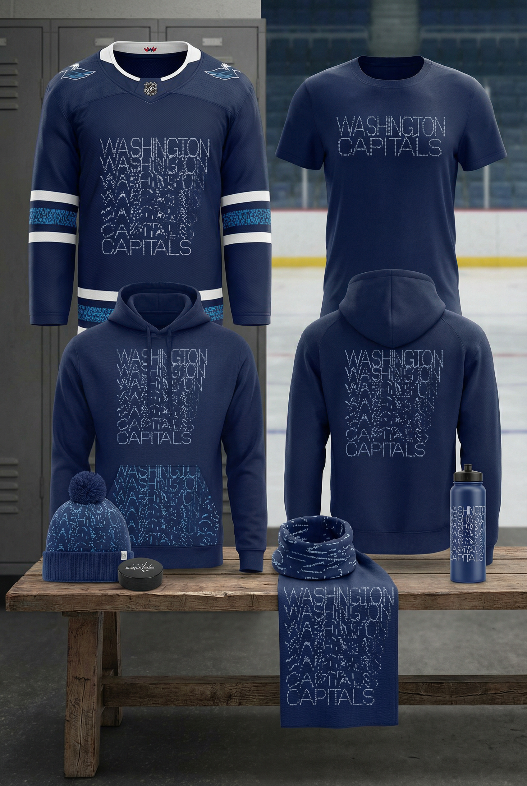
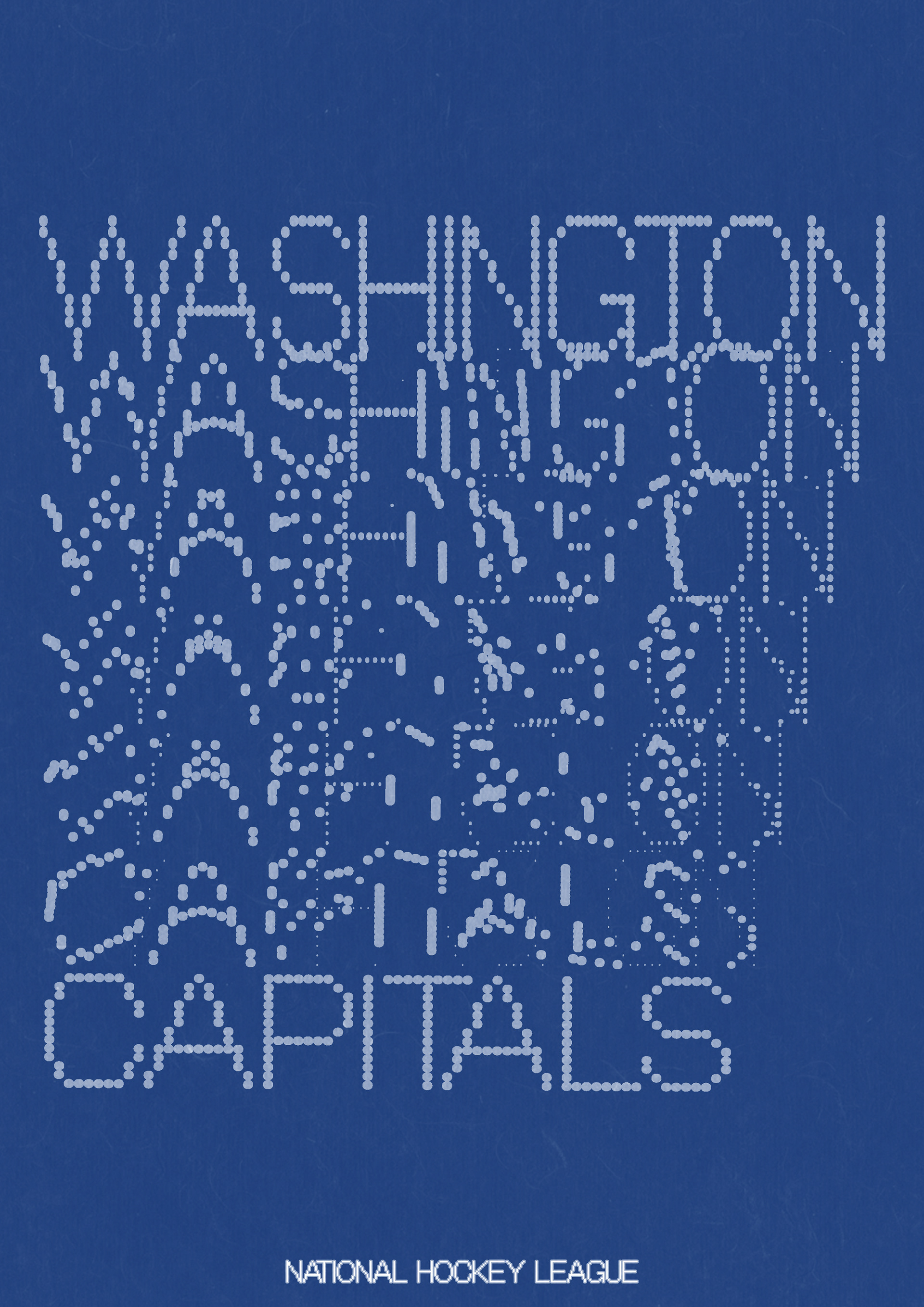
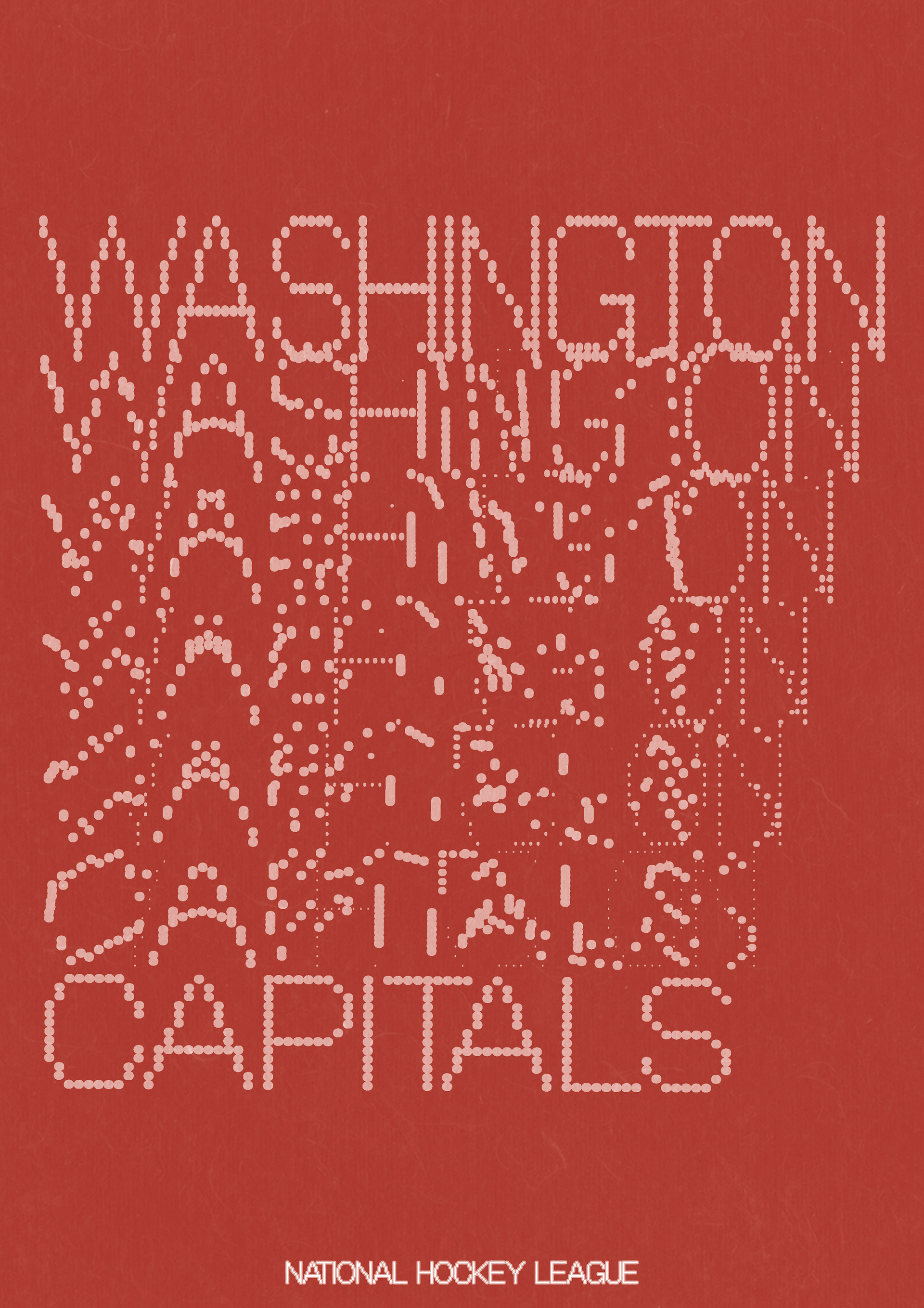
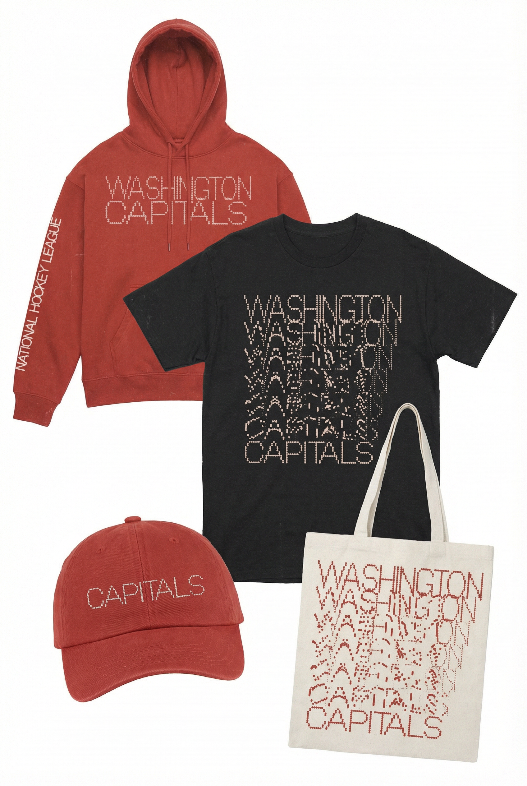
WASHINGTON CAPITALS - A modular dot-matrix typography system inspired by arena scoreboards and crowd movement—designed to feel alive, fragmented, and loud like the game itself.
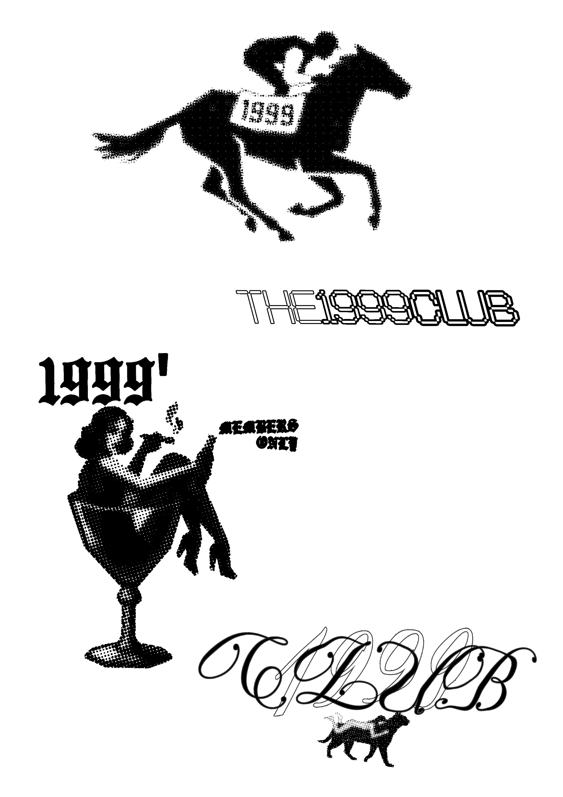
LOGO SHEET FOR THE1999CLUB, MY OWN START UP BRAND.
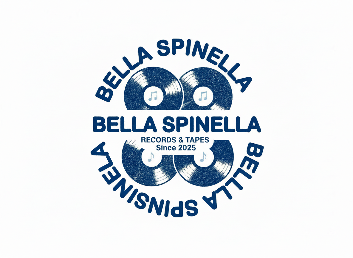
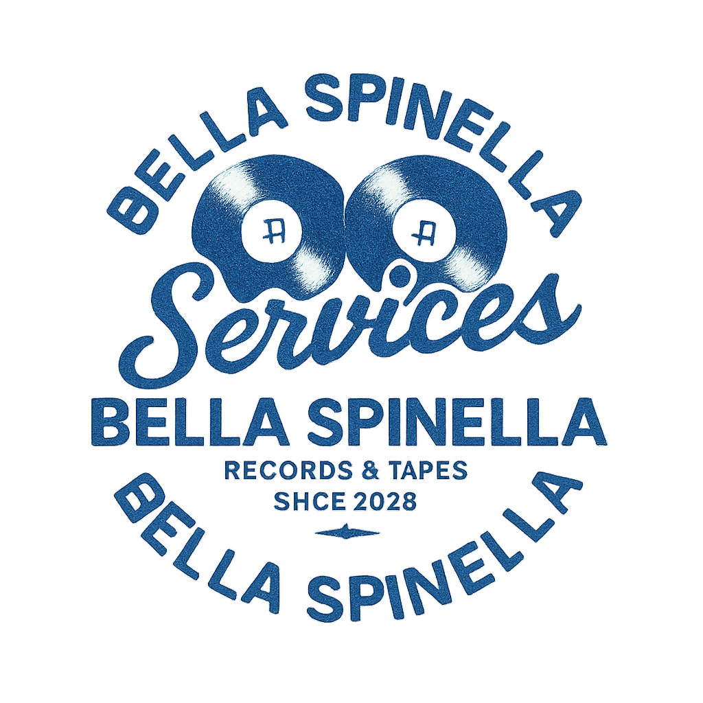
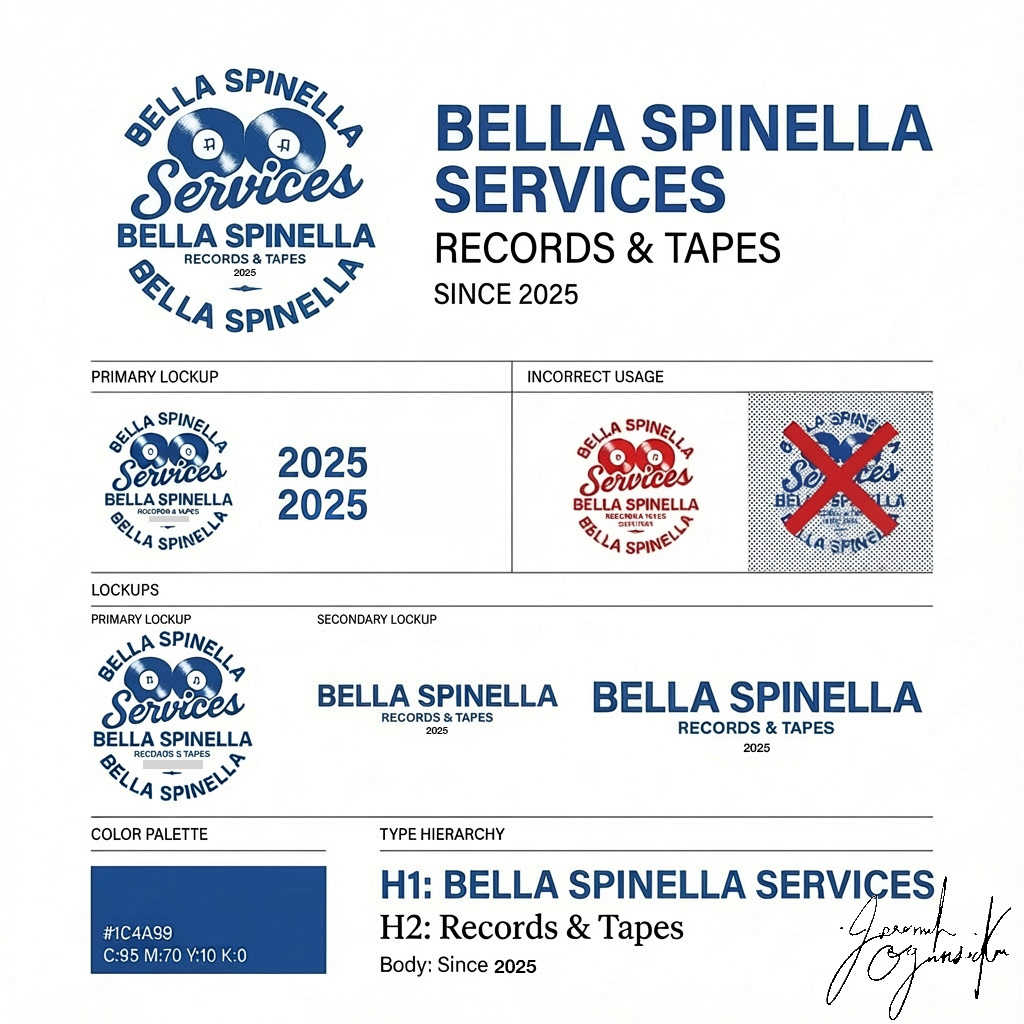
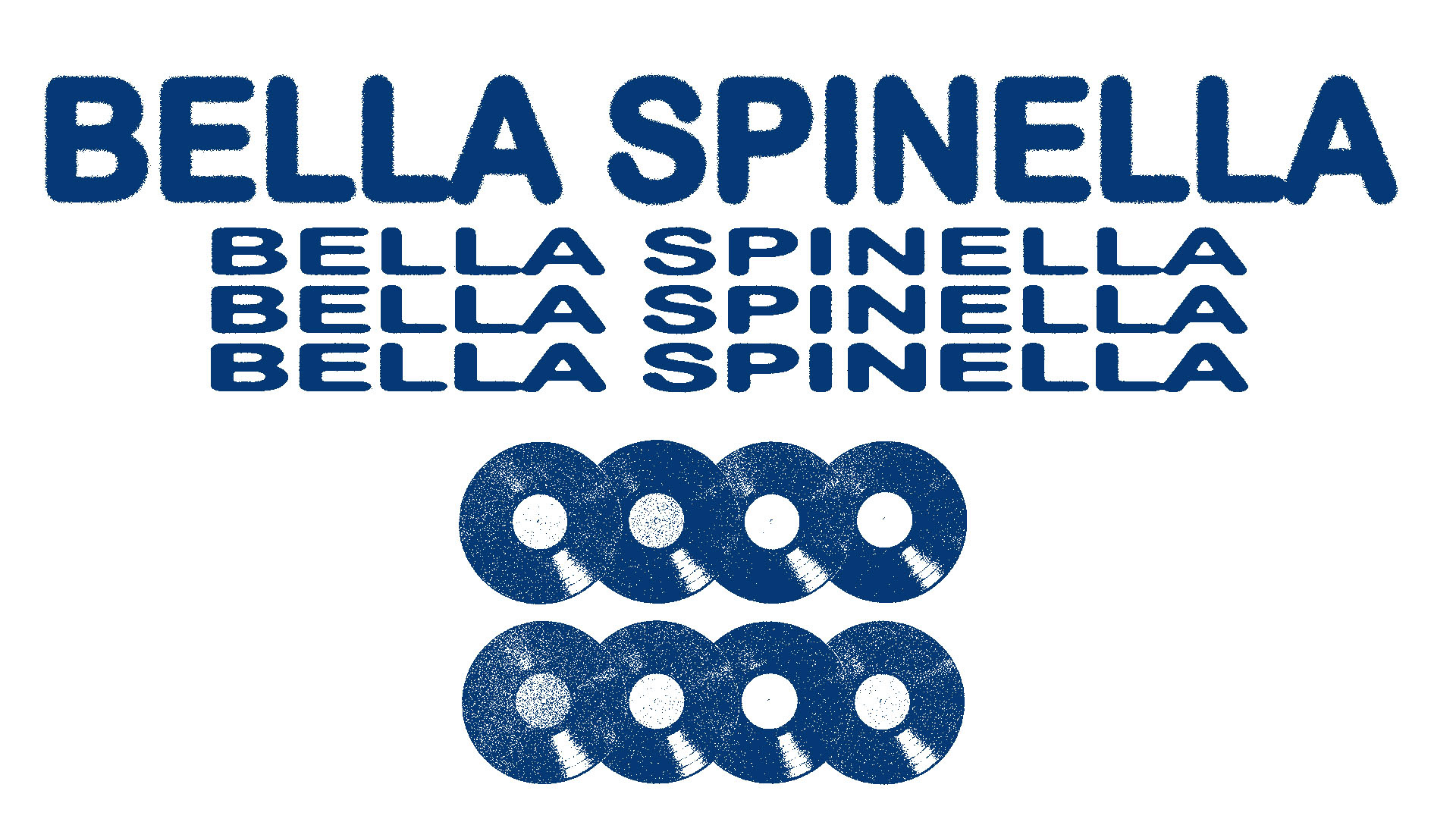
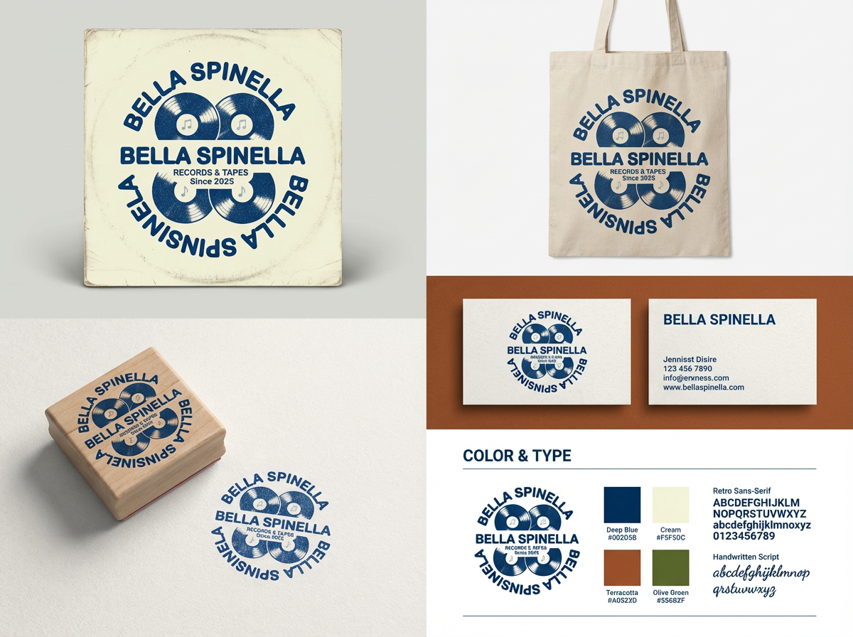
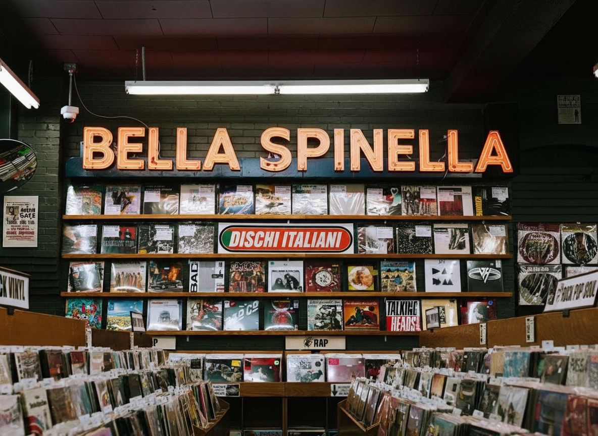
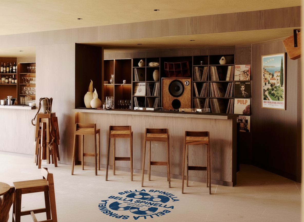
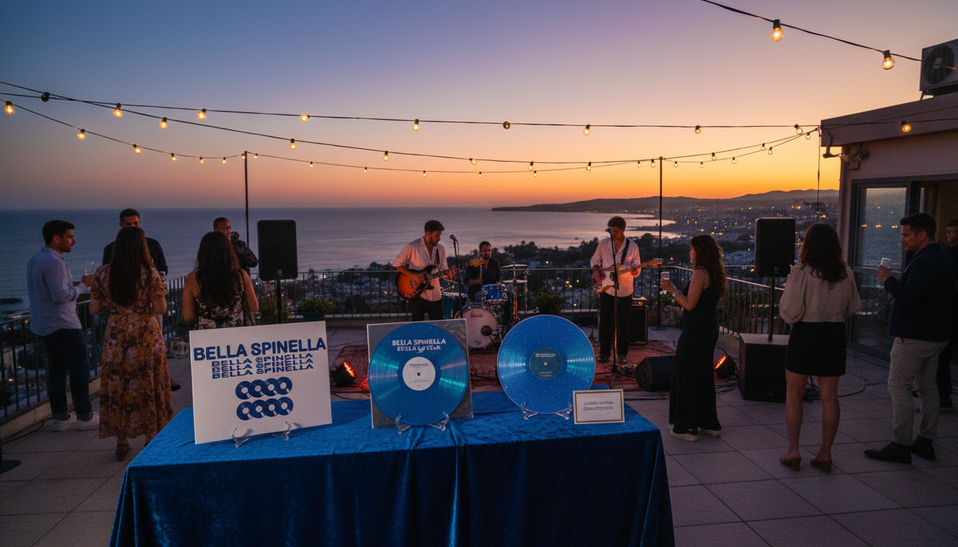
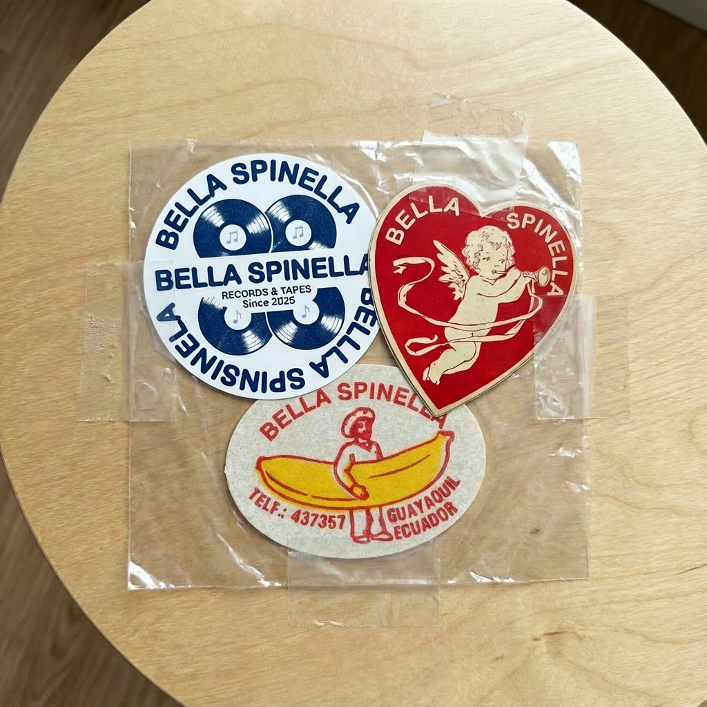
A nostalgic Italian record store identity featuring a custom logo inspired by vinyl, culture, and classic Italian aesthetics — brought to life through signage, interior mockups, and branded applications.
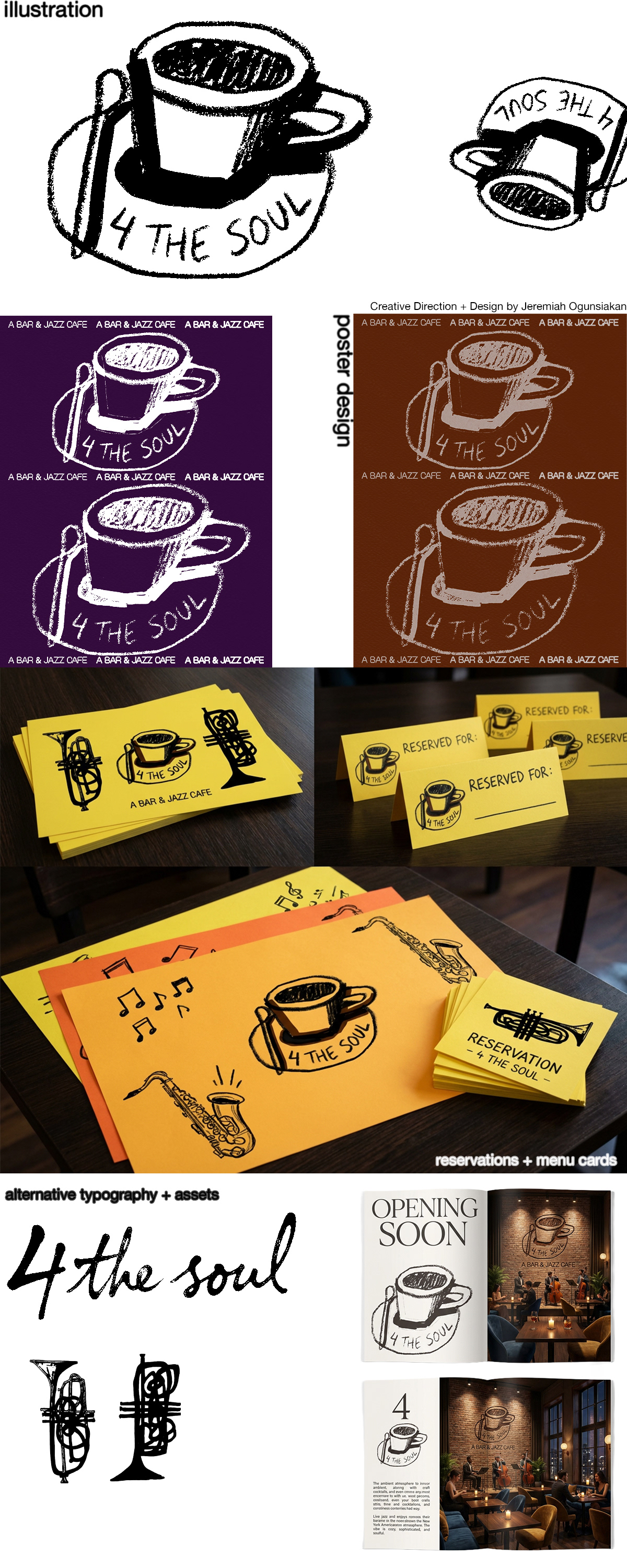
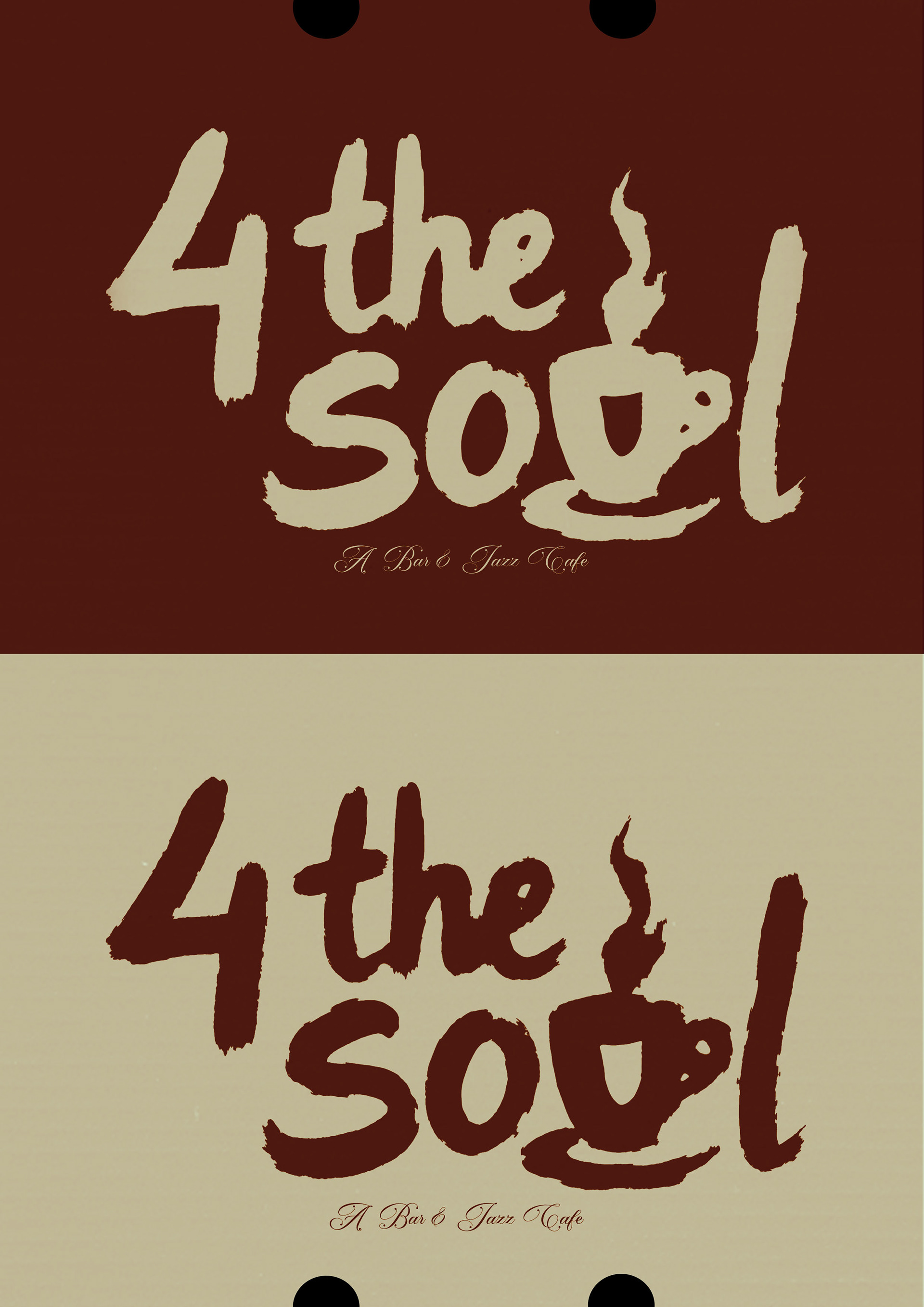
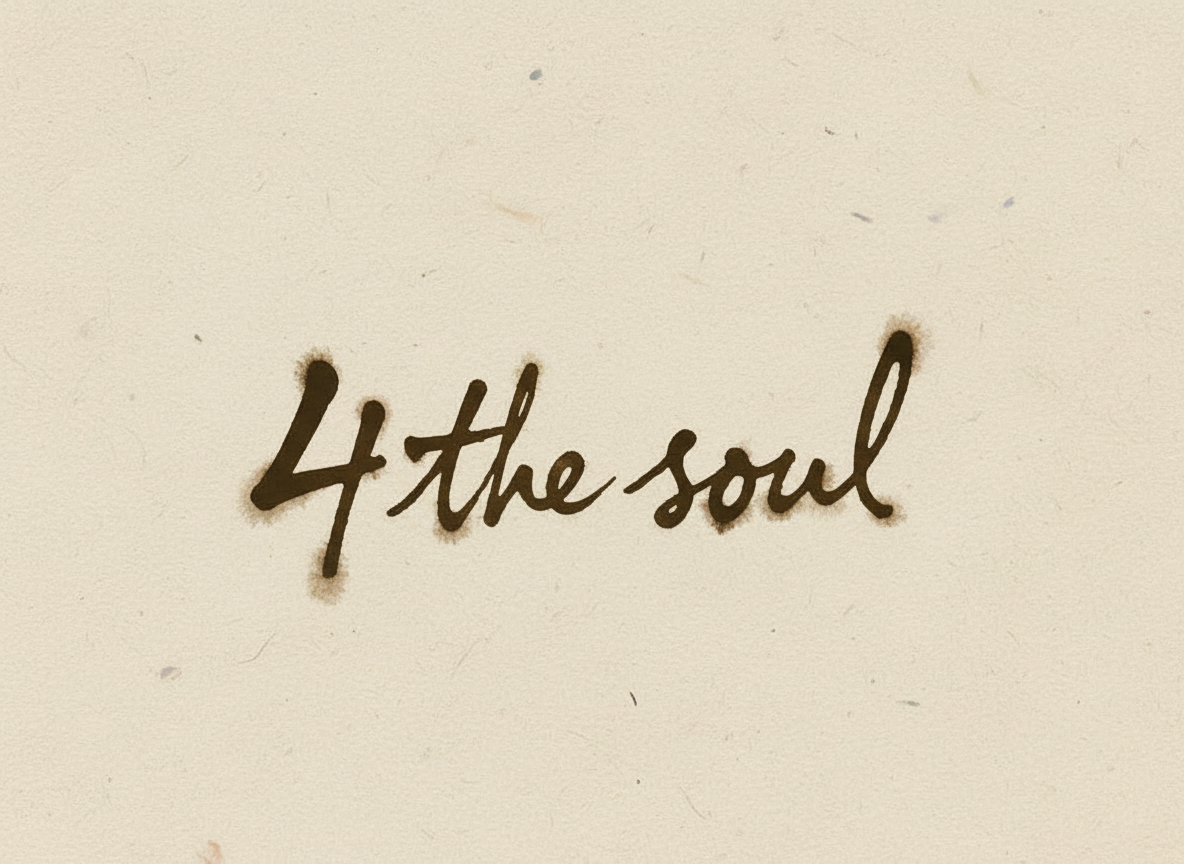
Custom Typography & Brand Identity — “4 the Soul” (Client Work)
A hand-drawn typographic logo and visual system designed for a startup jazz café and bar. The identity blends warm, organic lettering with Swiss design principles—balance, clarity, and restraint—creating a cozy, intimate feel that reflects live music, community, and soulful atmosphere. The mark explores motion through subtle swirls and imperfect strokes, giving the brand a timeless yet personal character.
A hand-drawn typographic logo and visual system designed for a startup jazz café and bar. The identity blends warm, organic lettering with Swiss design principles—balance, clarity, and restraint—creating a cozy, intimate feel that reflects live music, community, and soulful atmosphere. The mark explores motion through subtle swirls and imperfect strokes, giving the brand a timeless yet personal character.
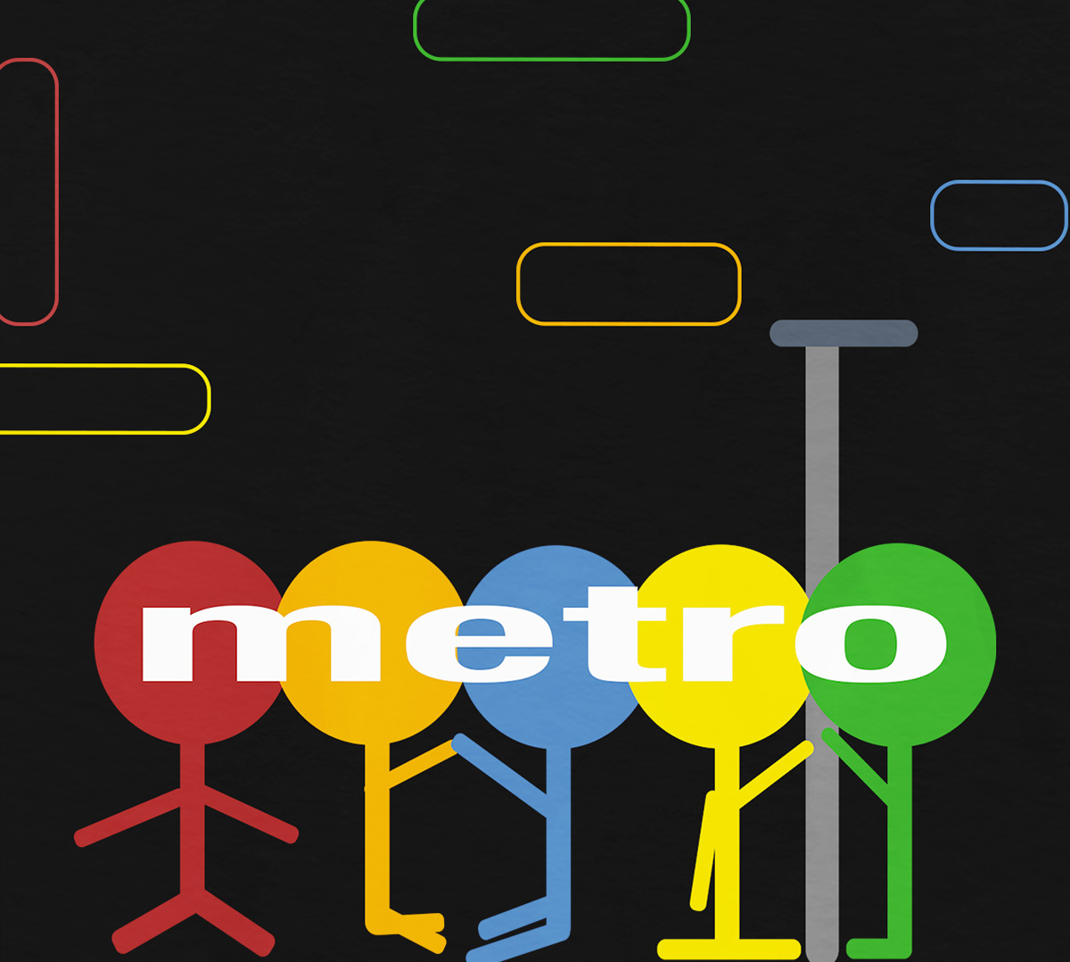
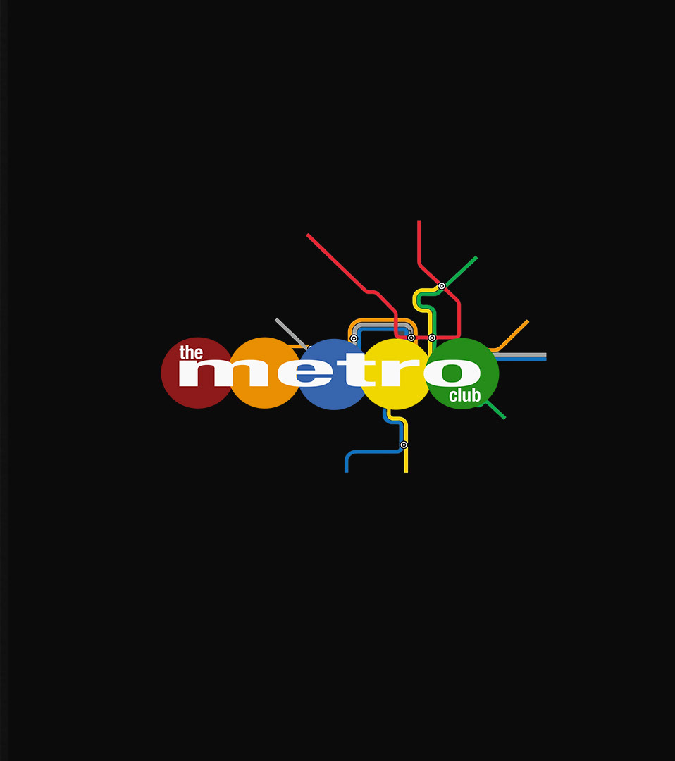
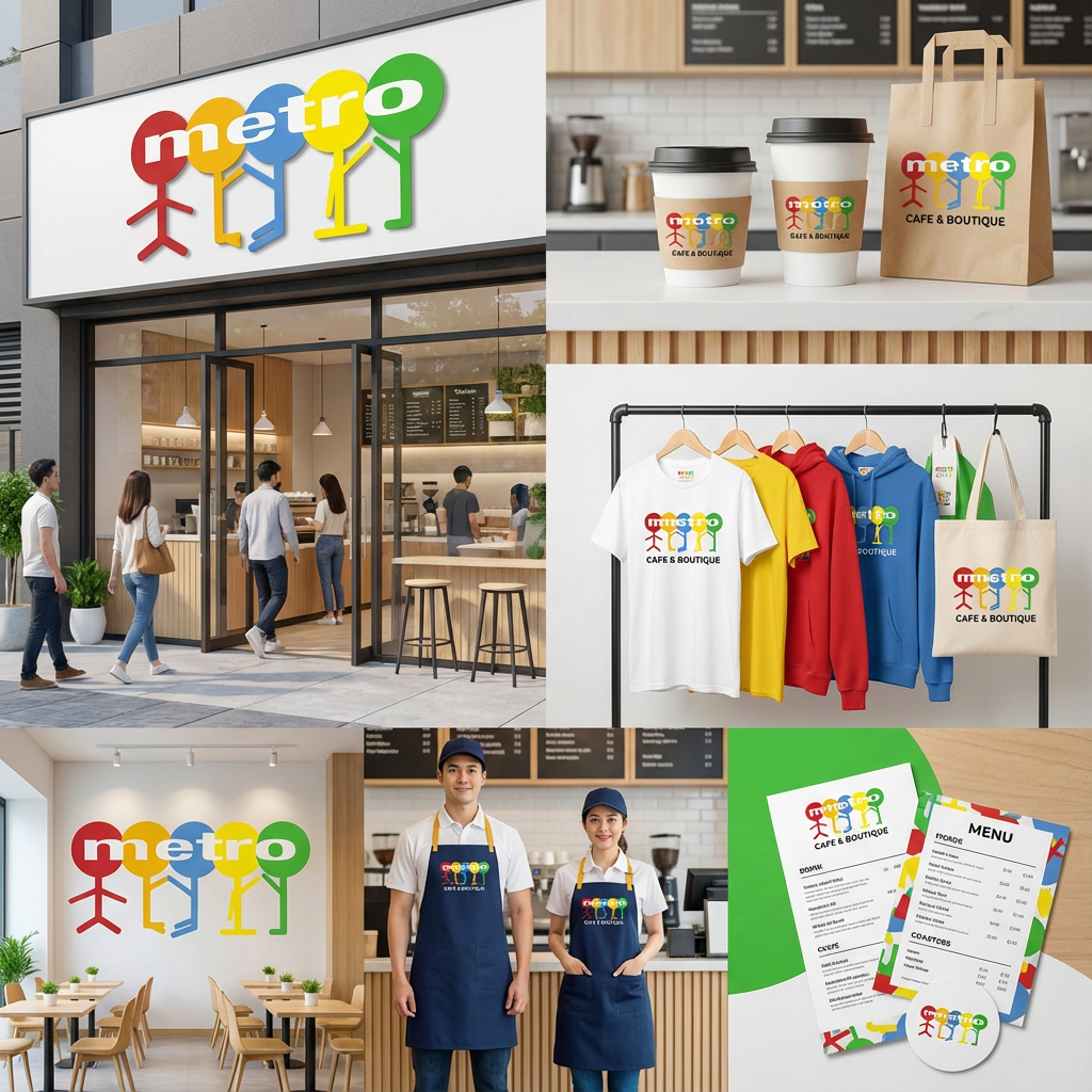
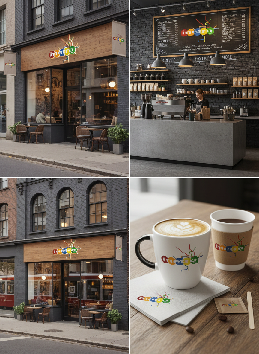
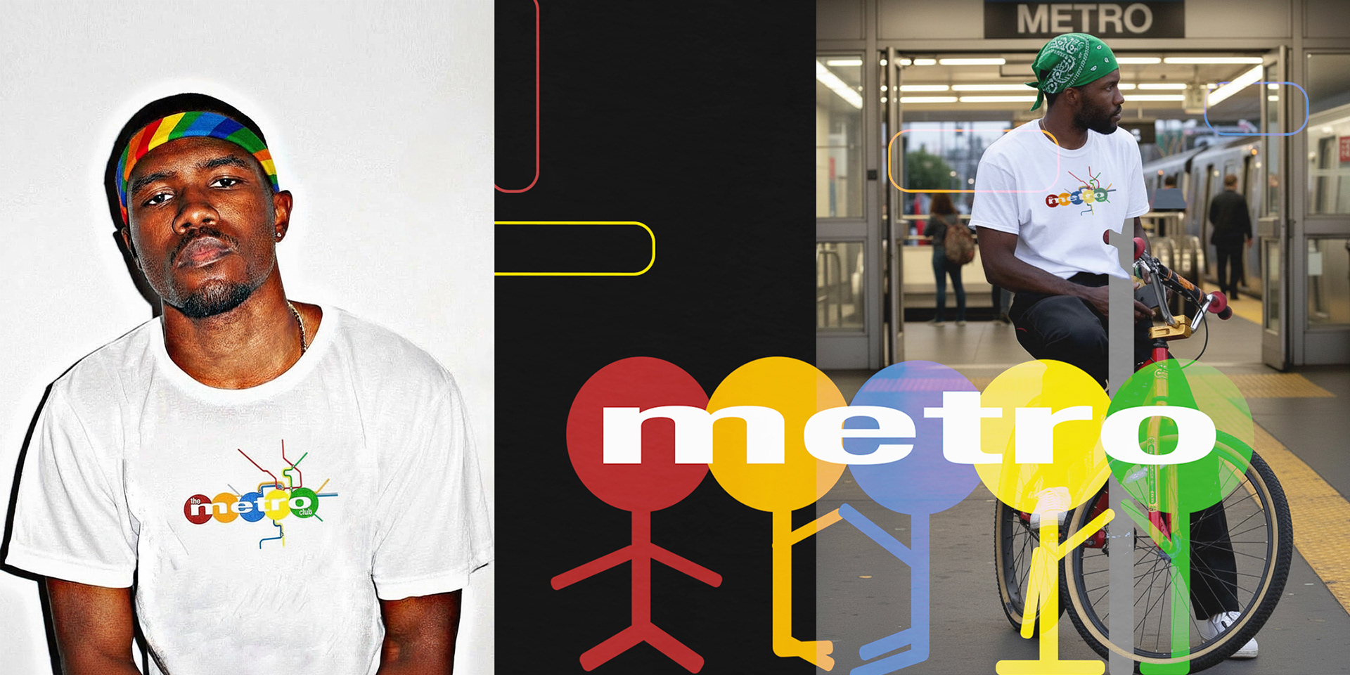
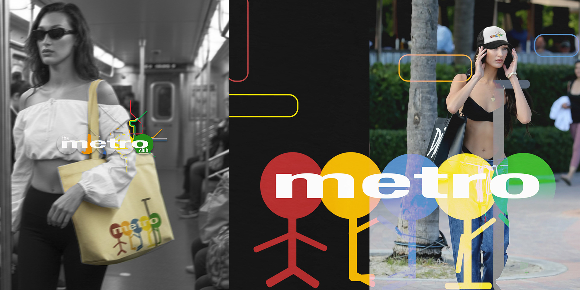
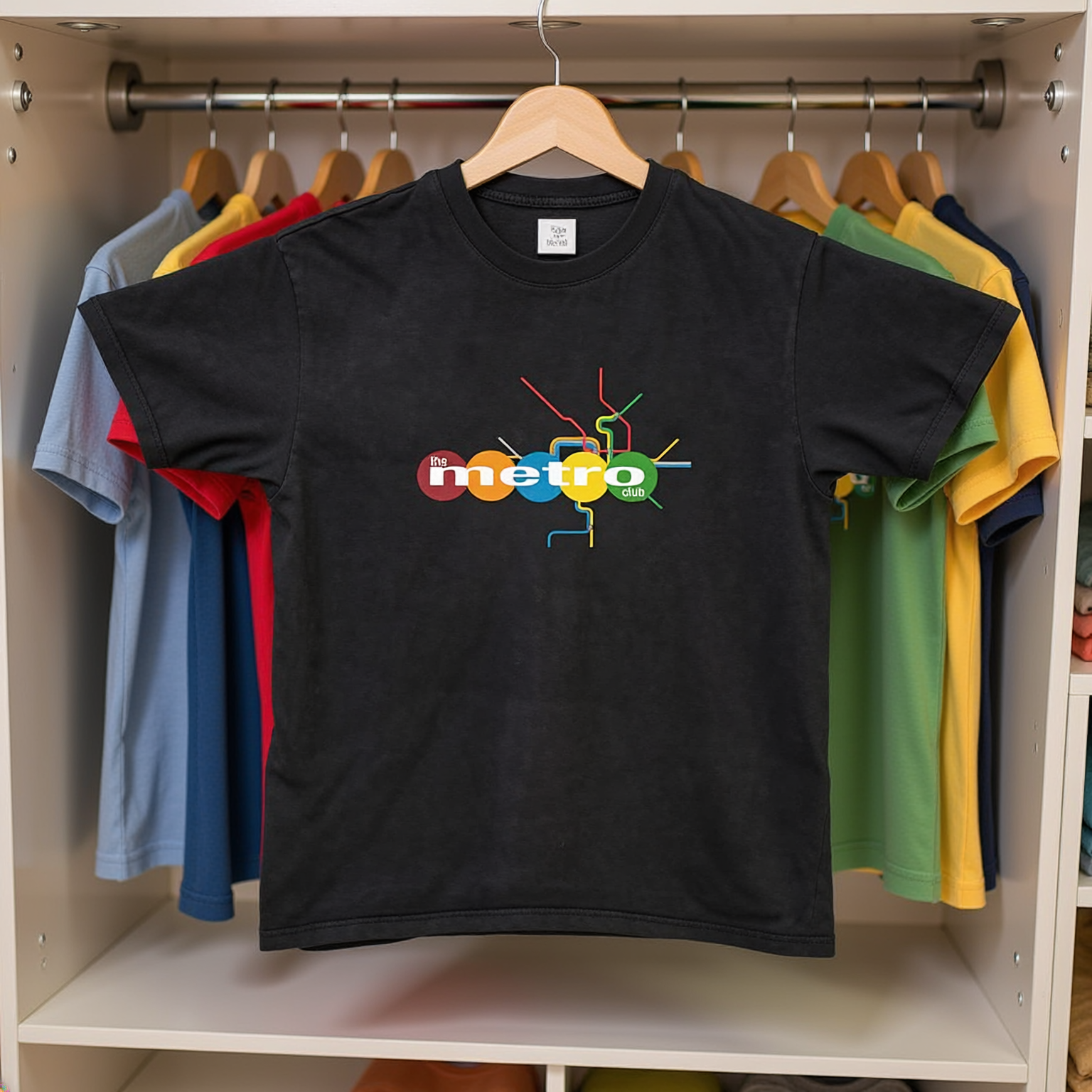
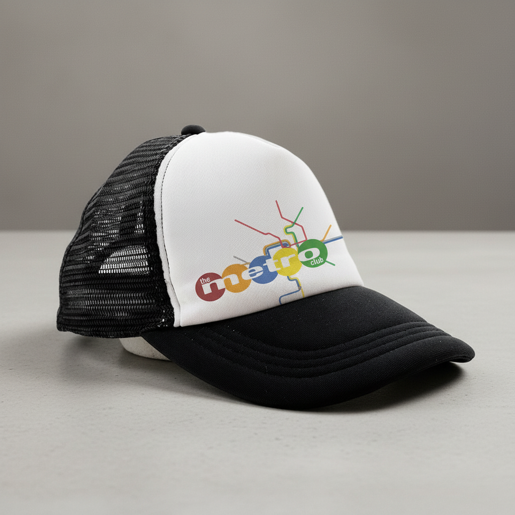
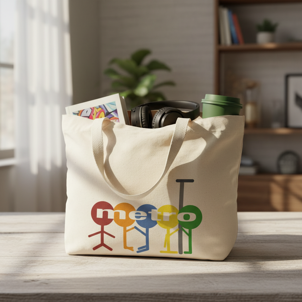
The Metro Club is a concept-driven brand identity inspired by public transit, movement, and urban culture—specifically the visual language of the Washington, D.C. Metro. The identity reimagines transit iconography as lifestyle branding, blending bold color systems, simplified figures, and route-line graphics to create a recognizable, modular visual world.
This project explores how branding can live across environments: apparel, accessories, photography, and real-world settings. The logo system is designed to be flexible and scalable, allowing it to adapt seamlessly to merchandise, digital assets, and street-level storytelling. Styled photography and mockups place the brand directly within public spaces, reinforcing its connection to everyday movement and community.
The Metro Club functions as both a visual identity and a cultural experiment—bridging design, fashion, and place-based storytelling to show how branding can feel lived-in, social, and expressive rather than purely commercial.